I created a fold out zine on the topic of sexism in Adobe Creative Cloud. This contained my own digital illustrations and extracts from a series of interviews that I conducted with fellow female students.
The interviews highlighted the fact that the female students felt that if they when they acted professionally or assertive, they were labelled with negative sexist traits such as “bitchy” or “bossy”, whereas their male counterparts were deemed to be “strong” or “effective”.
Keeping the colour palette simple allowed me to highlight the stereotypical colours applied to both genders. The specific colours themselves were inspired by Pantone’s Colours of the Year. The final piece folded out to show a poster on the other side - “I’M NOT BOSSY, I’M THE BOSS”
Zine creation
Publication creation
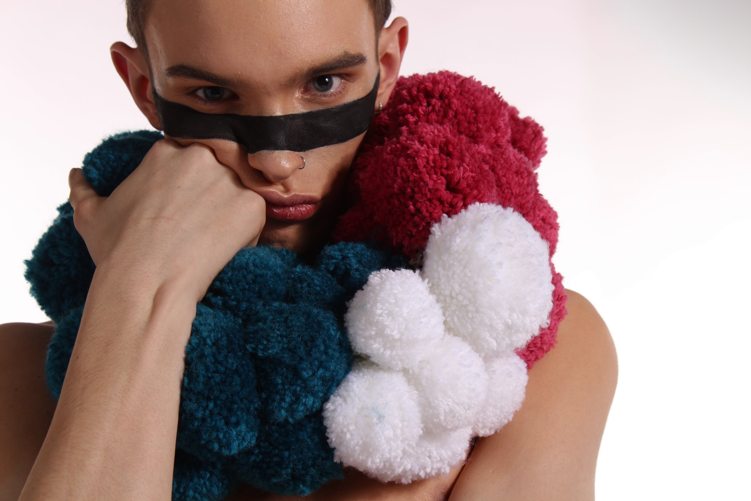
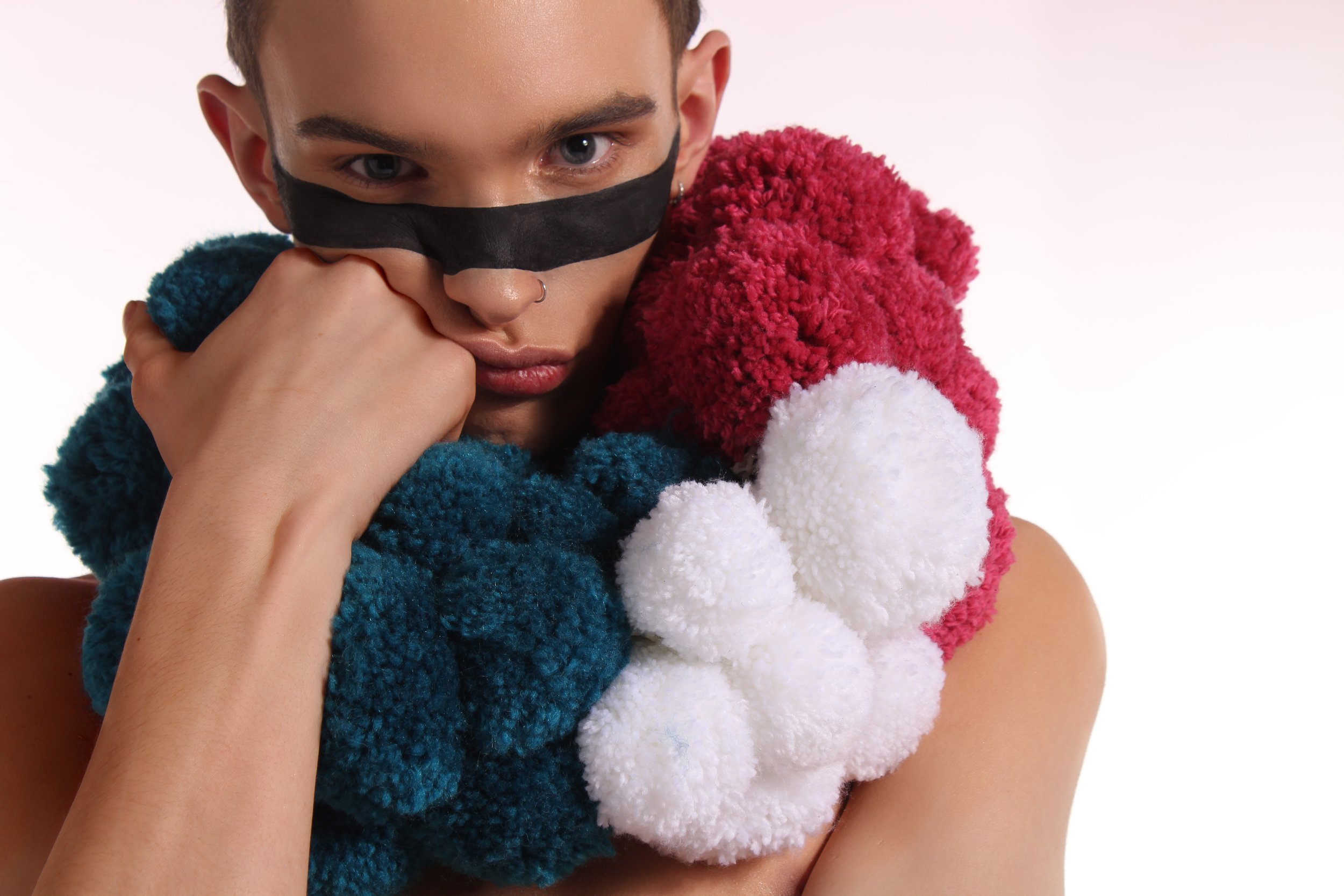
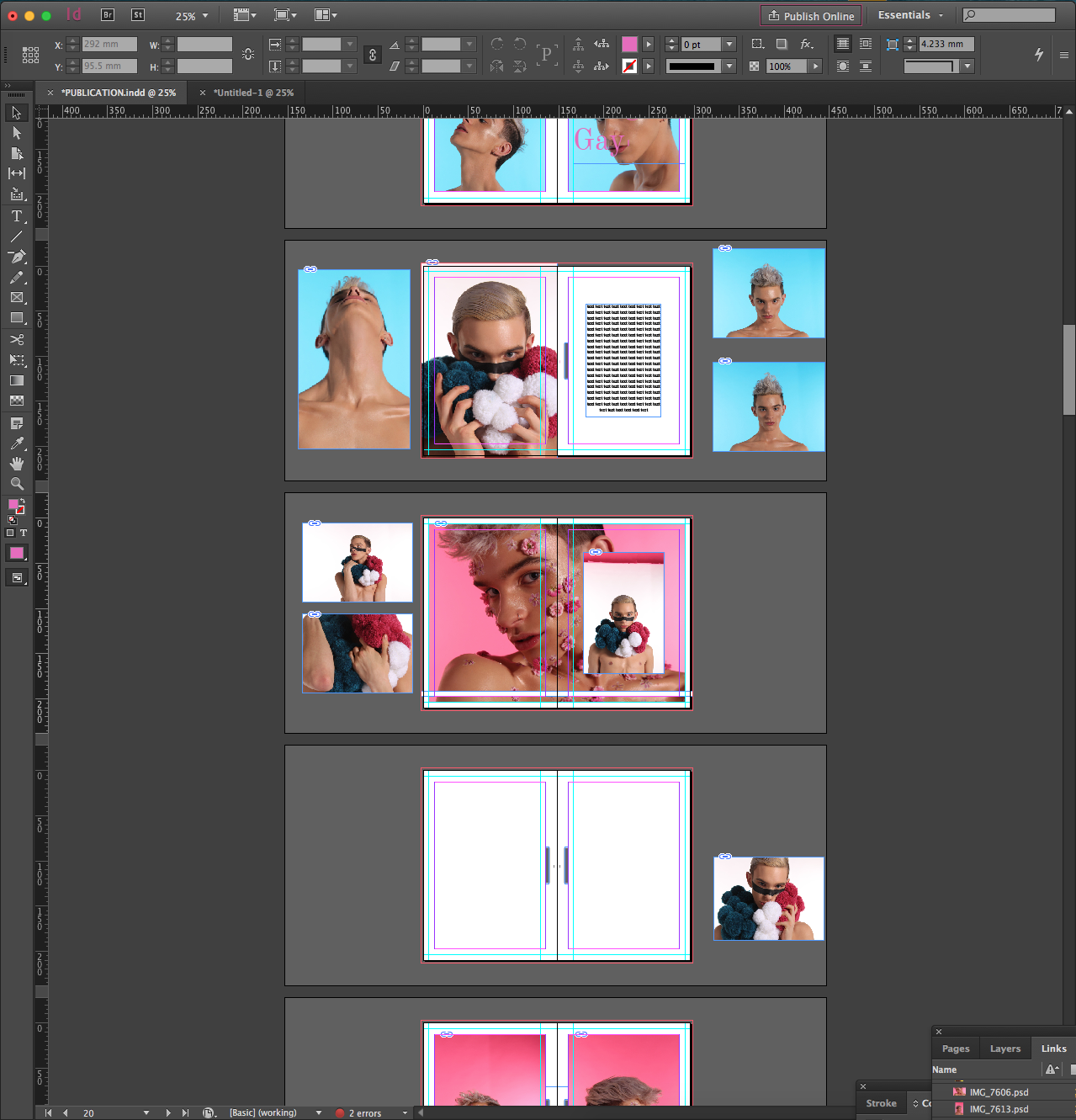
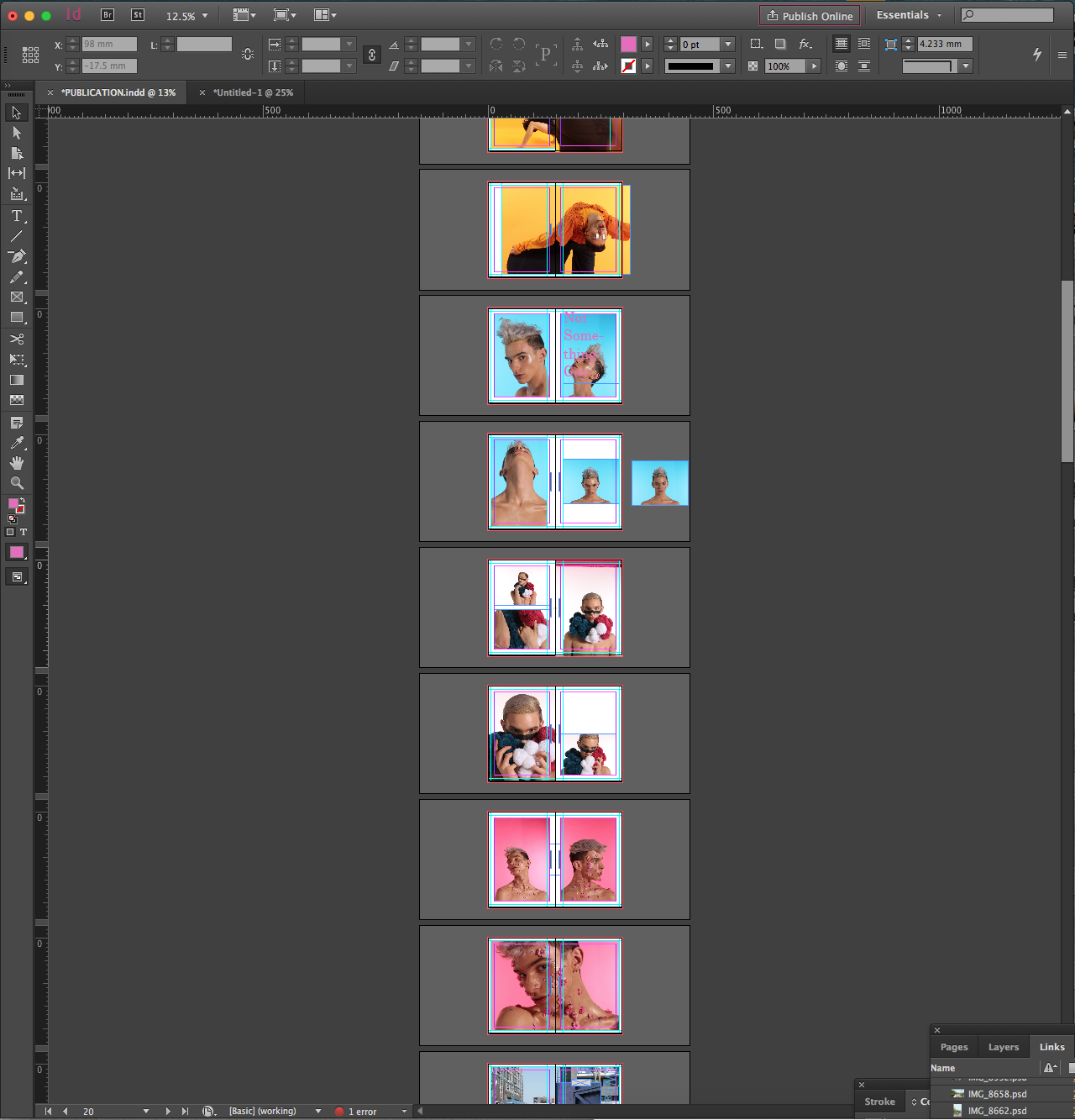
The culmination of my work at university was an 80 page publication, entitled ‘The Colour of Man’.
The work consisted of photographs taken from six different photoshoots, all styled, edited and taken by myself, the majority of which can be seen on this website.
It also contained written pieces that offered commentary on the images as well as a series of collages and other graphic design elements.
The finished piece was professionally printed @ Pressision, Leeds on a chosen combination of paper finishes, with a pearlescent card binding that subtly contrasts with the matte white title as the light changes.
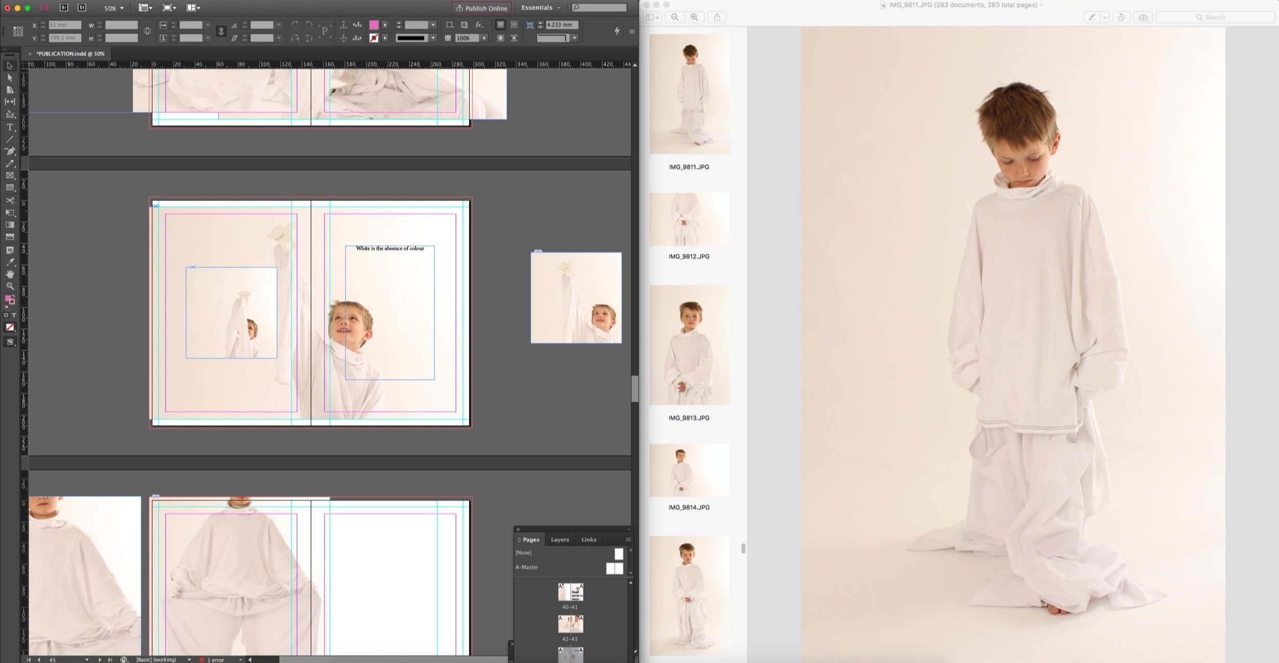
I am grateful to everyone I was fortunate enough to work with at Leeds College of Art, and especially those that helped me to produce this publication and the work seen on this website.
“From student digs to studio”
Creative & art direction
Whilst the university had great equipment and resources, these are limited in supply and not always available - studio space especially was in great demand. Sometimes you need to work with what you have got.
A great example of this is the work that I produced for D&AD New Blood Awards. I chose to base my shoot on the proverbs “Don’t put all your eggs in one basket” and “You can’t make an omelette without breaking eggs”.
Being responsible for the entire project allowed me to adapt and change my working style in order to fit the brief and work within limitations. For the shoot I built three small sets, created props, and then lit and photographed them with a modest lighting set up in my communal (and messy) university living room.
Whilst I did not win, I was proud that my final images were chosen by Leeds College of Art to represent them at the D&AD awards.


In order to create the most striking images possible, both in print and web use, I have used Photoshop to tweak elements of my initial photographs from simple cropping that emphasises the subject to modest retouching to tone down glare, fix lighting and colour balance issues, without creating a false narrative.
Photo editing


